

Building Foundations That Stand the Test of Time.
2026
Client
Terramark
Built to Last: A Brand as Solid as Steel
Every great structure starts with a solid foundation, and logo design is no different. Our task was to visualize that permanence.The icon is bold, geometric, and unmistakably purposeful. The “TC” monogram is constructed from clean, architectural lines that suggest both precision engineering and forward momentum. The circular element within the letterform creates negative space that breathes, preventing the mark from feeling heavy-handed despite its solid construction.
Green was a deliberate choice—not the predictable construction orange or industrial grey, but a rich, grounded emerald that signals growth, sustainability, and forward-thinking approach to building. It’s a color that says, “We’re building the future, not just replicating the past.” The gradient adds depth and dimension, suggesting the layers of expertise Terramark brings to every project.”TERRAMARK” sits in bold, confident uppercase—no-nonsense lettering that means business.


The Bold Bird Touch
This logo works as hard as Terramark’s crew. It scales flawlessly across applications: embroidered on hard hats, printed on architectural plans, displayed on construction site banners, featured in bid proposals, and stamped on safety signage. The simple, powerful design ensures instant recognition whether you’re seeing it from across a job site or in a boardroom presentation. Because at Bold Bird, we understand that in industries built on trust and expertise, your brand identity isn’t decoration—it’s the first foundation you lay. And we don’t build anything that won’t stand strong for decades to come.


Logos That Refuse to Stay on the Ground
Let’s design something that carries your story — and makes it unforgettable.

Ready for Your Logo Website Brand Package to Take a Flight?
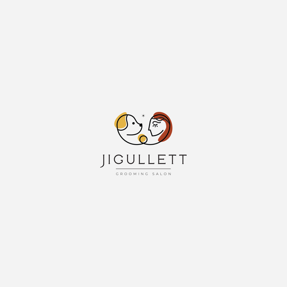
Grooming Salon
Grooming Salon
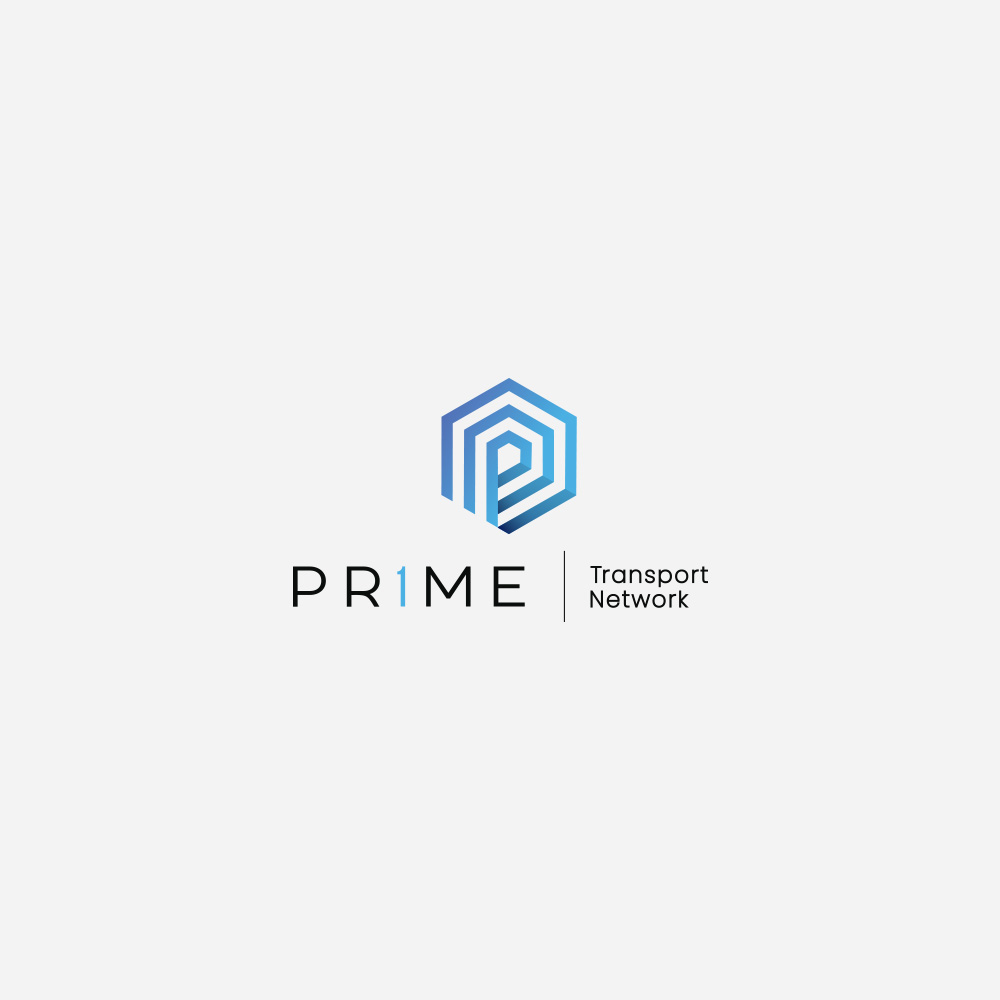
Prime Transport
Prime Transport
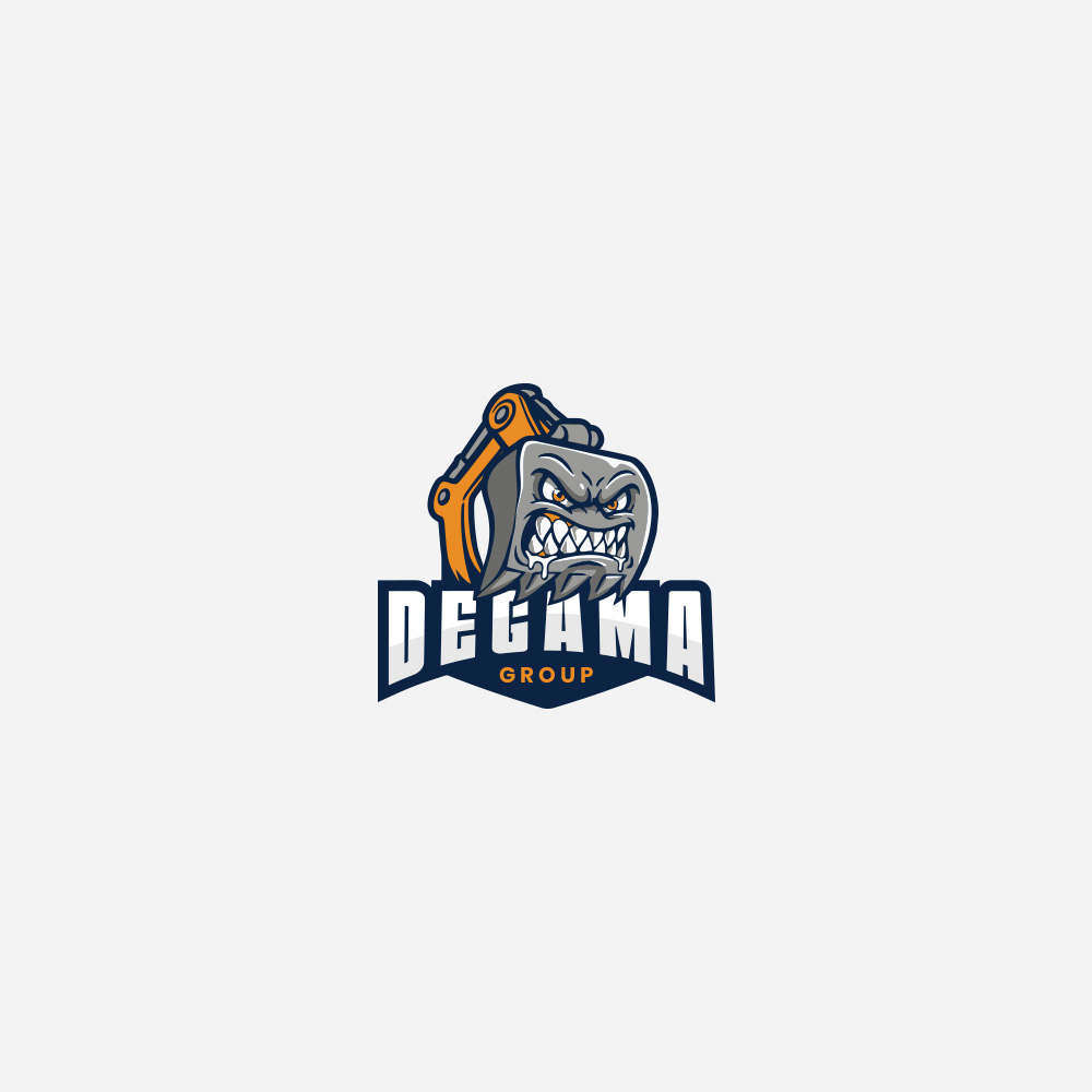
Degama Group
Degama Group
Flourish Business
Flourish Business