

Design That Says "Treats!" But Means "Relief!"
2026
Client
Paw Vital
The Itch We Had to Scratch.
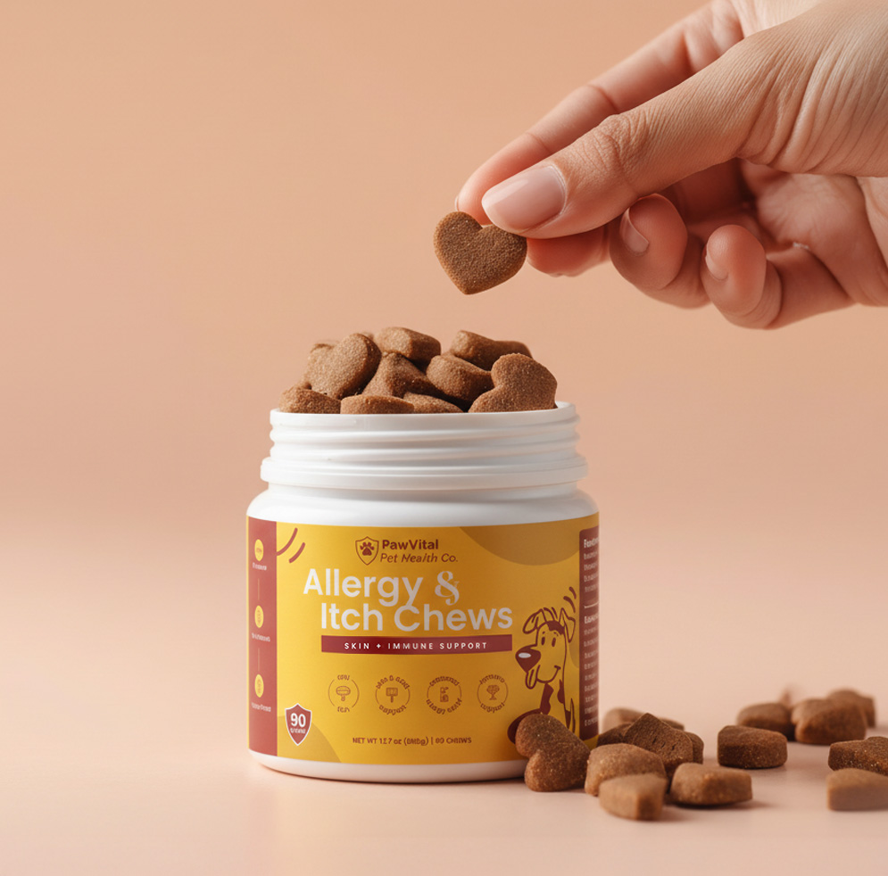
This wasn’t just another supplement bottle. This was a happiness container for scratchy puppers everywhere. The design leans into warmth and optimism—sunny yellows that pop on retail shelves, a playful illustrated pup that captures that post-scratch satisfaction, and clean icons that quickly communicate the good stuff inside.
Quick-scan icon symbols for fish oil, probiotics, and key benefits make decision-making effortless at the shelf. Clean, approachable sans-serif typography works seamlessly across all touchpoints, while thoughtful information hierarchy keeps active and inactive ingredients clearly separated for easy scanning.


Got a product that deserves more than a pretty box?
Let’s turn it into something bold, memorable, and impossible to ignore.