

Turning Fast Food into Fast Art.
2026
Client
Keerasa
Design That Feels Like a Ritual
Keerasa’s serum represents years of research, premium ingredients, and uncompromising quality. This isn’t drugstore skincare – it’s the kind of investment women make in themselves when they refuse to settle for ordinary. The challenge was to create a brand presence as refined as the formulation itself.The brief demanded elegance without pretension, luxury that feels accessible yet aspirational, and visual language that whispers exclusivity rather than shouting about it.


Bold, But Softly Spoken
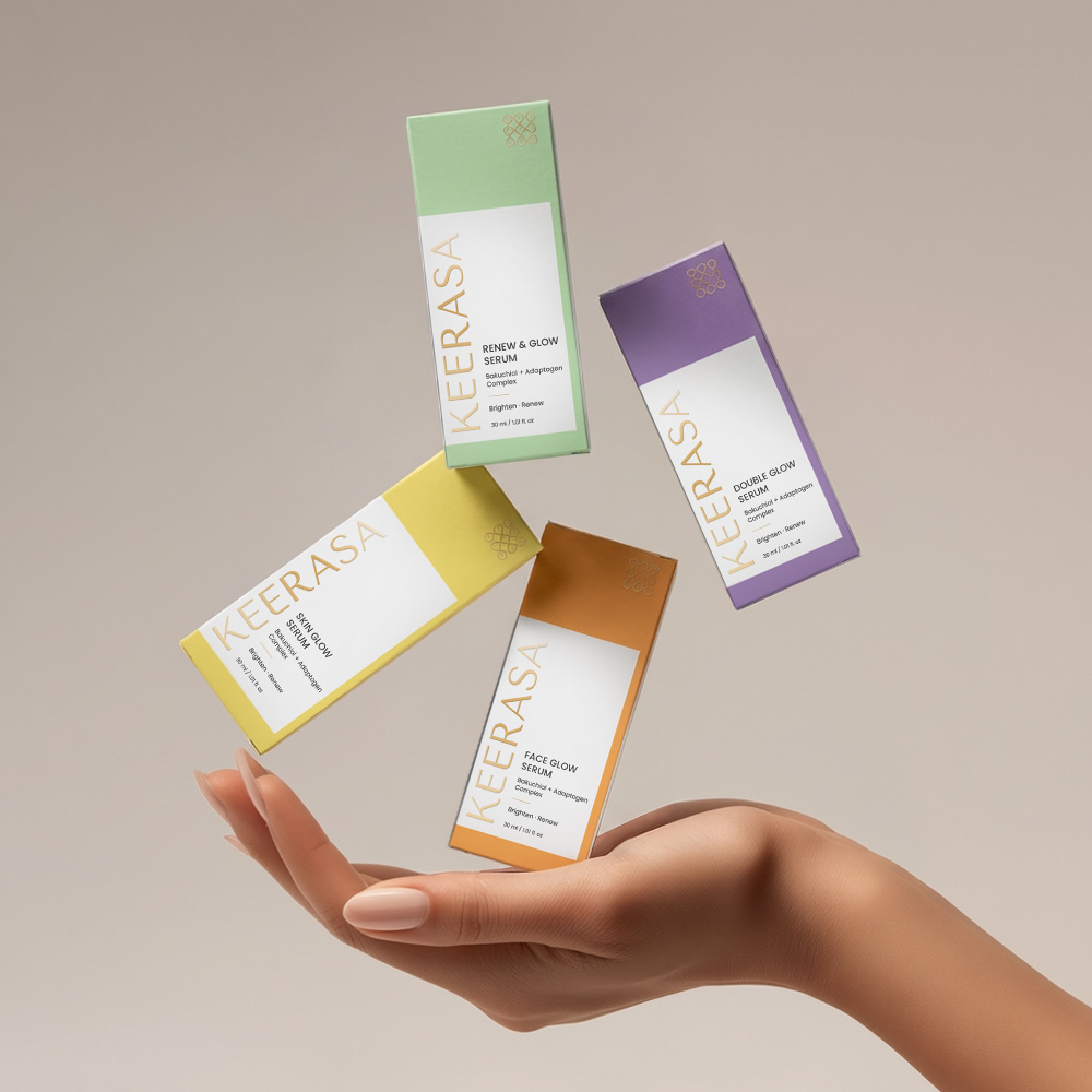
Clean lines. Generous negative space. Typography that speaks with quiet confidence. The color palette draws from nature’s most refined moments – soft creams, luminous whites, and strategic touches of gold that catch the light like dewdrops on skin at dawn. The packaging design became a meditation on minimalism done right. No clutter, no unnecessary embellishment – just the essential elements composed with architectural precision. The bottle itself becomes an object of desire, something you’d display rather than hide away.


The Color Game
The color palette for the packaging was carefully crafted to feel fresh, refined, and quietly luxurious. Soft lavender brings a sense of calm and balance, while warm amber tones reference the serum’s active, nourishing ingredients. A gentle pastel yellow adds optimism and glow. Together, these Pantone shades create a harmonious system that feels modern yet timeless – clean enough for a high-end skincare shelf, but warm enough to feel personal, approachable, and alive. The colors don’t shout; they glow softly, letting the product speak with confidence and elegance.
Why It Works?
Keerasa launched with the kind of quiet confidence that turns heads. The brand immediately positioned itself among prestige skincare names, earning placement in premium boutiques and upscale spas. Customer response validated the approach that this wasn’t just beautiful packaging, it was a brand that made people feel something before they even opened the bottle.

Your brand needs wings. We've got the whole damn flock.
Bold Bird doesn’t do boring – we create identities that fly high, hit hard, and leave a mark.

Ready for Your Logo Website Brand Package to Take a Flight?
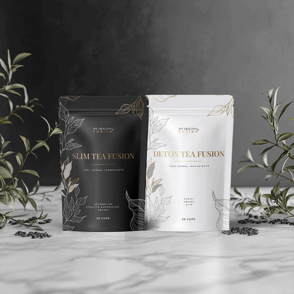
Tea Package
Tea Package
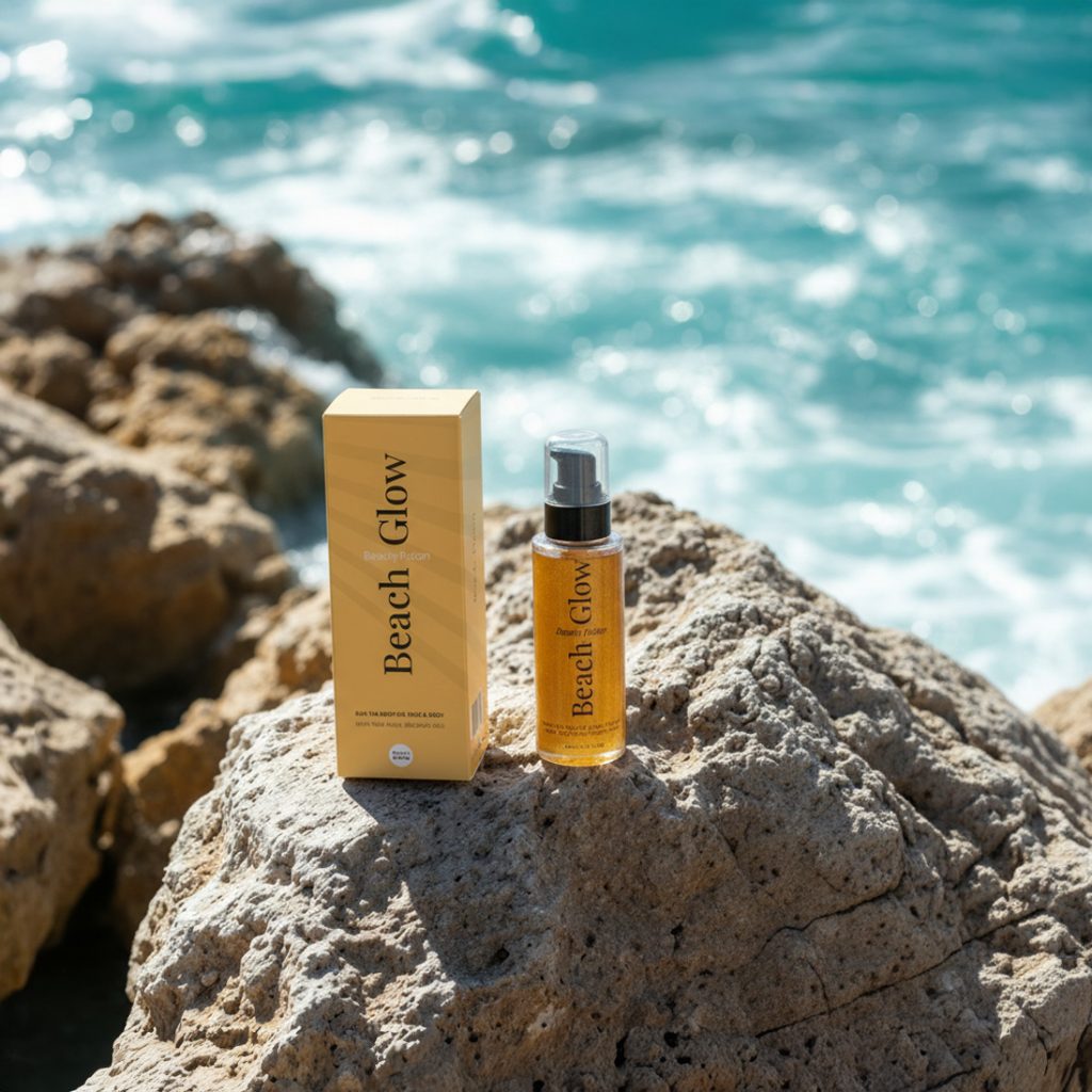
Beach Glow
Beach Glow
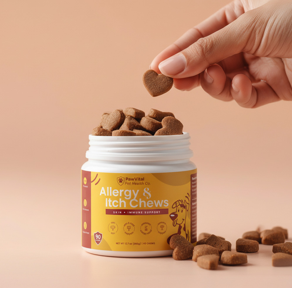
Allergy & Itch Chews
Allergy & Itch Chews
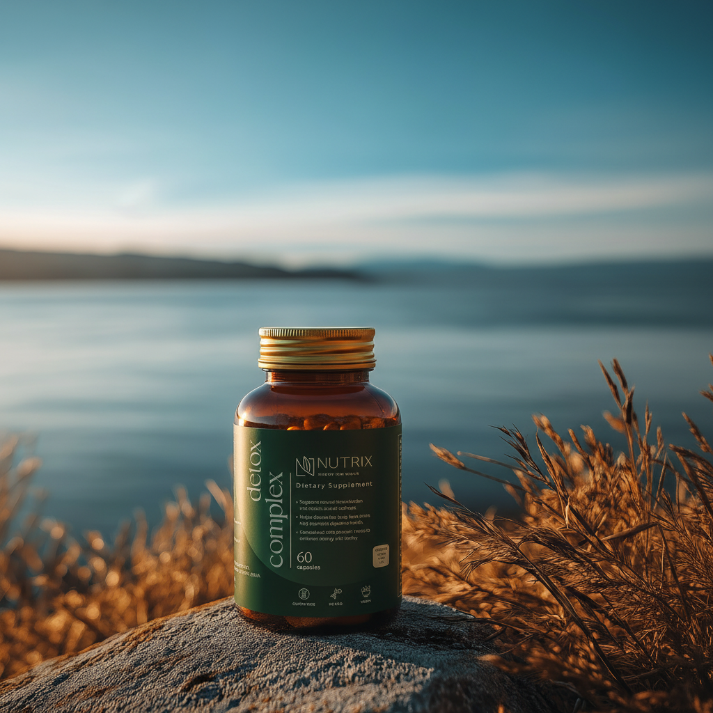
Supplements
Supplements